University Meals App — Design Walkthrough
May 10, 2016
This post is long overdue. In fall 2015, my friend Steeve Vakeeswaran and I decided that our school, Queen’s University, was behind the times. Accessing information related to the school is a difficult experience. Ultimately, we wanted a product where students could easily find any piece of school-related information on a single dashboard (news, classes, events, food, etc). We started small. Since we both like food and quickly ate our way through our meal plans during freshman year, we decided to design an app that gives students all the information they need related to food: weekly meals left, dining hall menus, recent transactions, money on meal card left, and a simple way for students to add to their meal plans. Here’s a walkthrough of designs that Steeve and I made.
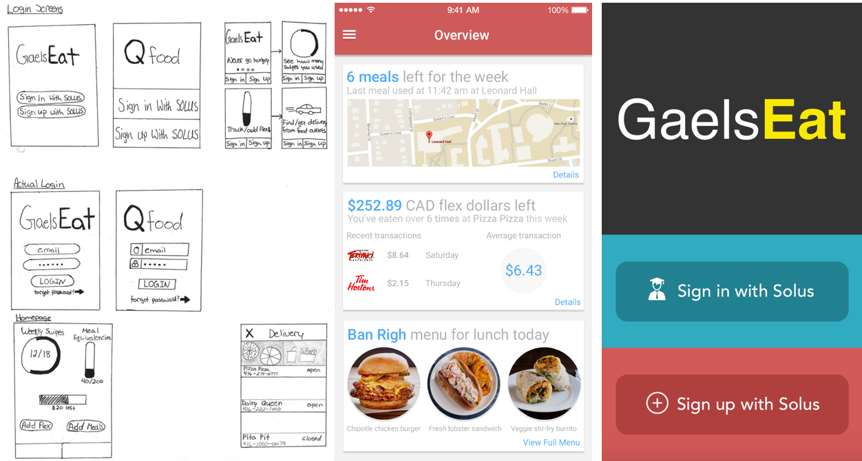
Initial Sketches
I drew the above designs on paper. The two sets of login screens — Login Screen directing to Actual Login — was intentional. Since this app must retrieve information buried within a student’s Solus account (where students manage their academic, financial, contact information), I wanted to remind students that they must connect their Solus to this app in order for it to work; when they enter their email and password, it's the same email and password associated with their student Solus account. Also, the login screen drawings feature three variations: one with standard bubbles, one with rectangles that take up almost half of the phone’s screen, and the last being a slideshow that previews the type information provided in the app. I wanted to capture a student’s attention at the login screen by making it look a little different.
Once logged in, students are brought to the Homepage that shows the amount of meals they have left for the week, flex dollars (cash on meal card) left for the year, along with options to add money/meals to their card. Most information that students needs can be found here. This is where the UX gets rough. I made two tabs at the bottom of the homepage for the Delivery and Dining Hall pages (didn’t fill the tabs with words), but I also included a menu icon on the top right of the Dining Hall page — this contradicts one another. Nonetheless, the basic idea is there. I showed this to my friend Steeve, who made some changes and mocked these sketches up on Photoshop.
Photoshop - Mockup
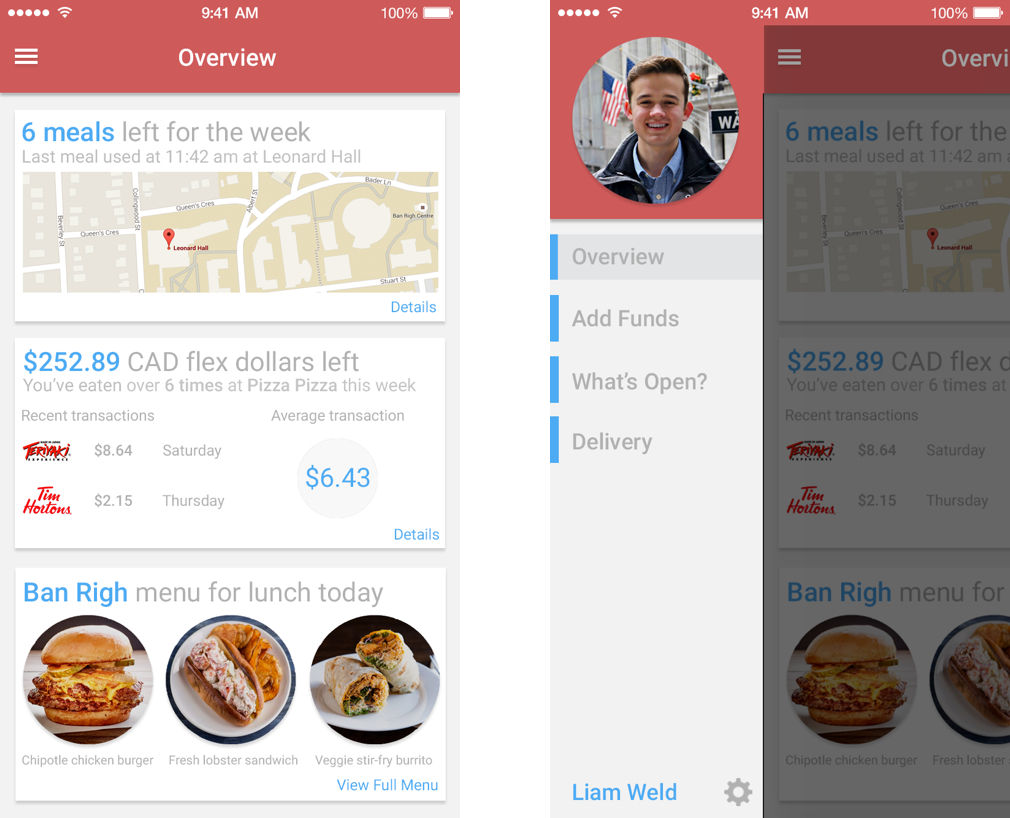
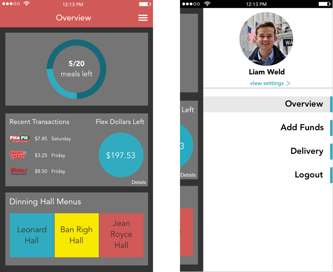
Steeve changed the homepage, now Overview, into a series of cards that when clicked, will expand to offer more information. He also added recent transactions, a dining hall menu, and some our school’s colours (blue, yellow, red) into the design. These were critical changes that I kept.
But, I didn’t see the use in adding a map of where students last used their card, as most people can remember where they last ate (this map was added to help a student locate a lost card). I also thought the average transaction piece was unnecessary information for a student, the amount of flex dollars/number of weekly swipes left should be a focal point, and that the Ban Righ menu card should include the menus of more dining halls.
I then went on Sketch to apply my changes and complete the design.
Sketch - Final Design
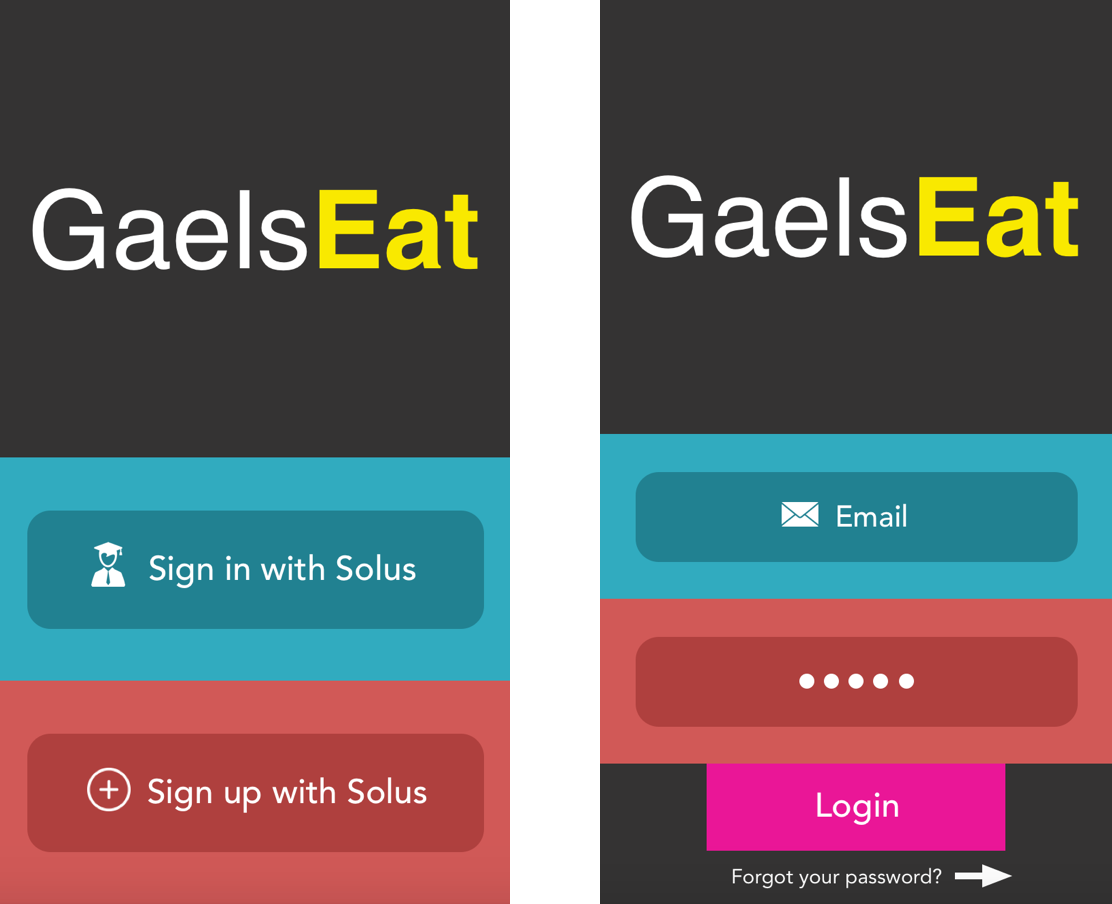
I decided to go with the rectangle-based Login Screen as it was unique, but not distracting like the slideshow screen. I made a point to include Queen’s Univerity’s school colours — blue, yellow, red — into the design. The name, GalesEat, stemmed from the school’s mascot, the Golden Gael (a fish, lol).
On the Overview screen, I really tried to focus on only displaying information that I believe is most significant to a student with a meal plan. With that goal in mind, I decided that the amount of weekly meals a student has left is the most critical piece of information to them (this literally determines if they can eat at a campus-sponsored outlet for the rest of the week). Due to this, I gave weekly meals its own card with a simple design.
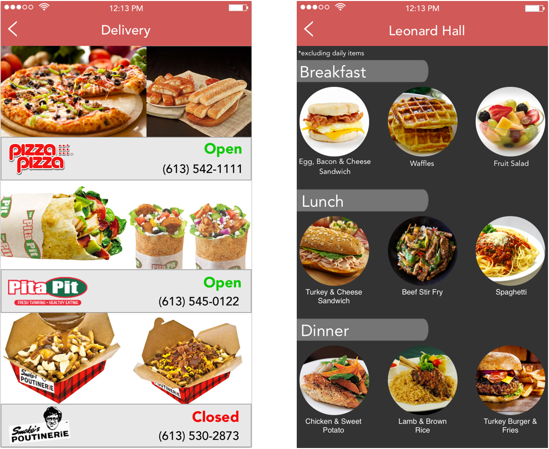
I kept Steeve’s recent transactions piece (good way for students to stay informed on how they’re spending their flex dollars), but replaced the average transaction size with a piece showcasing the amount of flex dollars a student has left in their account. This prevents them from running out of money and will serve as a reminder to add more money to their account when necessary. I also executed my plan of expanding on Steeve’s dining hall piece by including tabs of each dining hall that students can click on to view a menu.
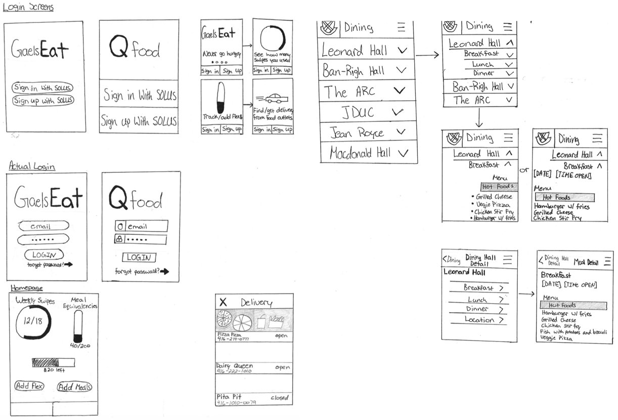
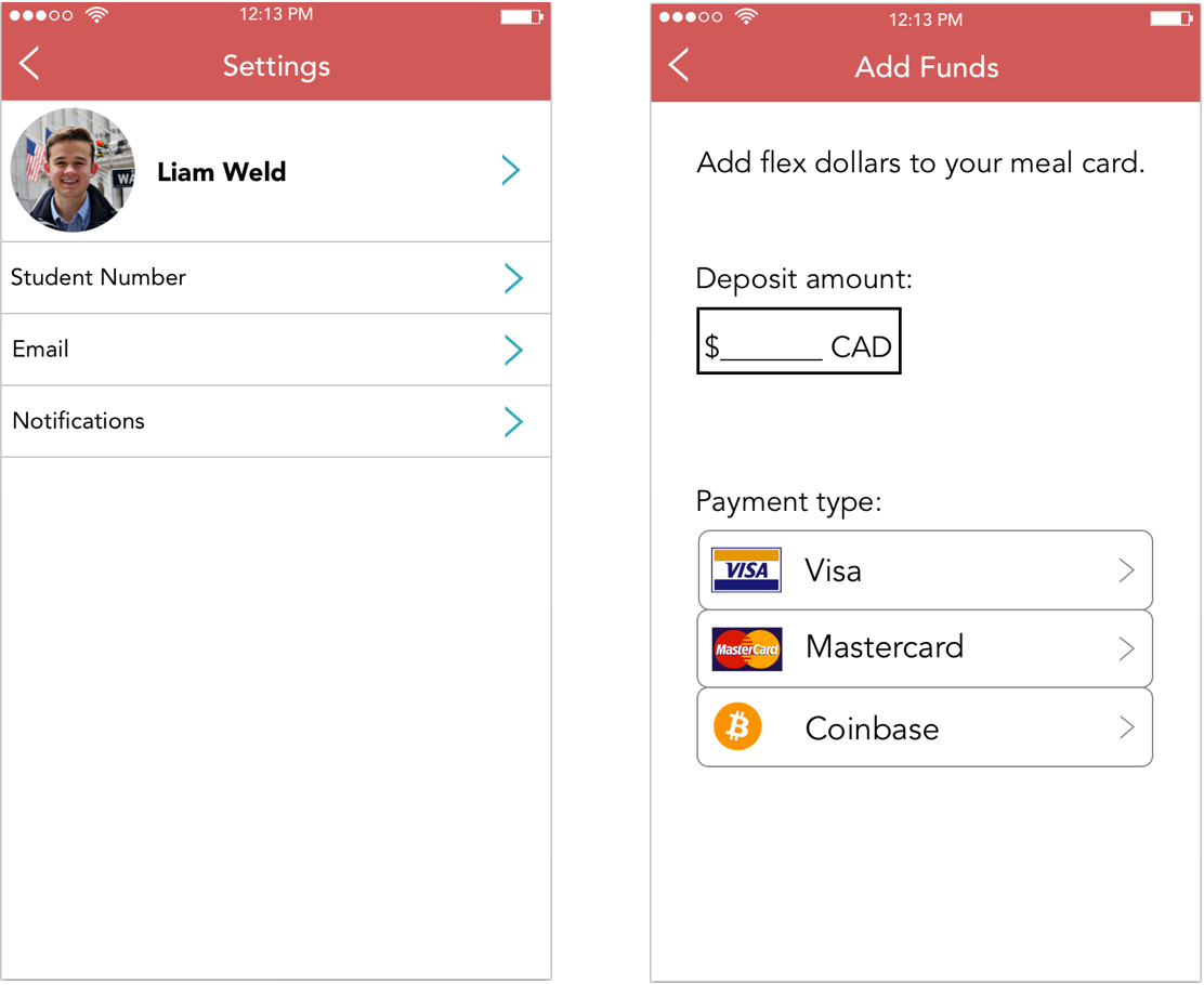
Upon clicking the menu icon (three horizontal bars at the top right of overview screen) a student is brought to a page giving them the option to view settings, return to the overview screen, add flex dollars, check what food joints are delivering, and log out. All of these screens are displayed above and are fairly self-explanatory. There’s only a few things to clarify: the arrows in the Settings page allow a user to edit that piece of information, the Coinbase icon in the Add Funds page was for fun (not sure if the school would actually implement this), the Delivery page simply shows who delivers at what times and how to contact them, the Leonard Hall page is an example of one of the three dining hall menus that a student can view, and when logging out a user will be brought back to the home screen.
That a wrap. Our first design project. Something to help students gain control over their eating on campus with the eventual goal of making school-related information searches easy. We are still contacting our university to build this app.